


Funds to Vote
AT A GALANCE
Funds To Vote is a website that enables everyday voters to independently research which industries fund their representatives to empower them to make more informed votes. A previous 2021 Capstone group came up with the concept of Funds to Votes and launched a barebones version of the website. Seeing lots of opportunities to improve the site, our 2022 Capstone team took over Funds to Votes.
The goal of this project was to take the original Funds to Votes website and do a complete front-end and back-end redesign to create a fully functional, user-centered website.
My Role
Visual Design, UX research, testing & prototyping
Project
University of Washington Information School Capstone
Duration
Senior Year
10 weeks
Winter/ Spring 2022


Hailey Meister
Front-End Dev
Olivia Victorino
Data Visualization

Me!
UX/UI Designer

Thomas Serrano
Back-End Dev

PROJECT INTRO
Problem Space Overview
According to Open Secrets, 83% of Americans believe contributions to political campaigns affect the outcome of an election. While most of us recognize the magnitude of funding on election campaigns, 53% of American voters don't know who is funding their candidates (AP-NORC). We know money is important in an election, but we don't know where the money is coming from. A 2021 Capstone team created the Funds to Votes website to solve this knowledge gap.
The Challenge - Website Redesign
The 2021 Funds to Votes team was extremely skilled, but no one on their team had much design or UX/UI experience. Because of this, the look and feel of the website were not at the forefront of their site development process. The site lacked visual interest, clear data visuals, and features that would directly add to user experience. Our challenge was redesigning the Funds to Votes website and improving the overall user experience. In other words, it needed a digital facelift.
Design Process
Research
Define
Prototype
Testing
Final Product
Literature Review
Market Reseach
User Research
Design Deep Dive
Define Goals
User Personas
Design Principles
MVP
Usability Testing
Concept Validation
/ Lessons Learned
Step 1: Research

Research Boards & Insights: To avoid letting our personal political biases influence our site, we conducted extensive research to ensure we were designing a valuable product that benefited users of all political ideologies and degrees of political literacy.


Original Website Design Review: With a firm understanding of our problem space, my next step as a designer and a user was to analyze the current website. This process would help me understand what design elements need to be improved and identify how the user flow needs to be reimagined. To do this, I walked through the design of each screen of the current website, made notes of what stood out, positive or negative, and gathered inspiration for my redesign.


Step 2: Define
After gathering research and identifying the key pain points, it was time to define what goals we wanted to achieve within the scope of our timeframe.
Re-Design Must Haves:

Balance the amount of white space
Reduce heavy text with photos, icons, and data visualizations
Add filtering to improve search functionality
Design a feature to compare representatives to improve user experience
Create a developer-friendly back-end for future Capstone groups
With our goals defined, our next step was to define our users' goals. We created user personas to visualize who our users would be and the type of use cases they would have to ensure we were developing a solution that met their needs.
-
Uninformed Voter
-
A business owner who wants to vote for someone whose policies favor small businesses but doesn't know where to look
-
Thinks news outlets have too much basis to use for effective research
Per sona 1
-
Political Strategist Intern
-
Needs to research the best candidate for the organization to endorse
-
Looking for data visualizations to help support his choice to his bosses
Per sona 2
-
Social Media Activist
-
Usually votes down a ballot but has voted against her interests in the past by doing so
-
Social gets her information from other social media accounts and wants to research herself
Per sona 3
-
Campaign Manager
-
There's dirty money in the party and wants to show voters her candidate is honest
-
Teams political party has a bad rep and needs transparent data to clear rumors
Per sona 4


click for more persona details
Step 3: Prototype
Design Principles
Neutrality
In the US, red and blue are the main colors associated with political parties. I wanted the color palette to convey our promise of neutrality further, so I selected colors opposite red and blue on the color wheel: green and orange. I also wanted to keep the theme green to stay true to the original team's website.
Consistency
Adding features and enriching the user's experience was a primary goal of the design; I also had to be mindful of the existing user flow and information architecture. The goal was to enhance the user interaction, not require the user to re-learn how to use the site. Staying consistent with how the original developer structured the site ensured the design wouldn't disorient the user.
Simplicity
A core value of Funds to Votes was to help everyday voters feel empowered with knowledge without being overwhelmed with political jargon. To expand on this principle, I ensured clarity was built into the design. From providing example text in the search bar to show the possible text formats to including explanations and definitions to fill in information gaps, users are equipped to find the answers they're looking for.
MVP: Minimum Viable Product
I created our MVP prototype by leveraging the insights my team members and I gathered from research, the observations I made from the original site, and design principles rooted in our product's overall mission. The screenshots below are from my Figma Prototype, which includes filler text, photos, and data. Our developers replicated my designs in a pre-production environment with our finalized verbiage and data for the final MVP.


Step 4: USER TeSTING
With our MVP complete, we knew more had to be done, but we needed users' feedback to guide us through the project's next phase. What did we overlook? What needs to be changed? What just looks straight-up bad?
There were blind spots we knew we missed, but we could not know until we got a wide range of opinions from various perspectives. To do this, we asked a group of people who fit the demographics of our target user group to do their own walkthroughs of the original site and our new site.
We had three main concepts to validate:
1
2
3
Was there anything we excluded from the original site that users feel should've been included in the redesign? Similarly, what shouldn't have been included?
Gather feedback on our newly created comparison tool
We had the data to show contributions, but what other data did we need to really give users the information they were looking for
**UX/UI related only
Constructive Feedback
Corrective
Next Steps
Applying Feedback
There was a general consensus that the original site wasn't aesthetically pleasing and did not catch new users' attention. However, most people believed the home page was bland, and nothing stood out as a visual focus throughout the site.
I overdid it with the principle of
simplicity and need to add depth to my designs. I added a secondary color and utilized tools like overlay and gradients to improve the visuals without crowding the white space

The stand-alone graphics were not easily understandable for people unfamiliar with this space. Many were unsure how to decipher the data to make any useful conclusions.
I would include definitions and explanations on each page with data graphics in the final product. There was no direct call out on it, but to make the search credentials clearer, I added full examples into the search bar to avoid users getting search errors.

People wanted to know how Congresspeople voted on various bills, including bills unrelated to their funding background. While seeing who funds them gives an idea of what they might favor, bill voting history would show users what they have actually voted on in the past.
In addition to the contribution data, we added a bill voting history section to the single result page. My challenge would be to design this text-based section that wasn't text-heavy but still rich enough to add value to the users.

User Approved Design
-
The addition of photos of congresspeople makes them feel "real" and more recognizable
-
Prominent "Take Action Button" on single result page; gives clear next steps after learning about the Congressperson
-
Overall, the new website is better organized and welcoming than the original site
-
The new comparison tool was well-received and useful to users

Full
Responses
STep 5: Final Prodct

After 10 weeks, the Funds to Votes website had finally reached the end of the product development life cycle and was ready for its official re-launch. Funds to Votes' digital facelift was complete.
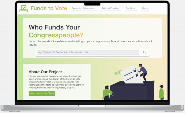
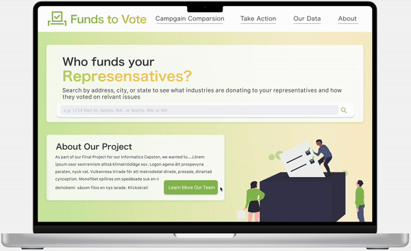
Although my full design couldn't be replicated due to technological and time constraints, I am really happy with where the project ended. Minor changes had to be made between my final mock-up and our final product to fit within the team's limitations. Below is my final mockup of how I envisioned the final product. In the following section, the rest of the screenshots are from the final live website, with the minor adjustments we worked through as a team.
Final Mock Up


Final Live Website


FINAL THOUGHTS
We wanted to add so many more features: a social media sharing function, relevant articles on each congressperson's page, and expanding the search to people running for office for the first time who wouldn't be in our database. Although we couldn't fit all of it within our 10-week timeframe, after our project, we posted our website back into the pool of projects 2023 Capstone students could take over. As soon-to-be graduates, we hoped that a new group of talent would keep making it easier for voters to be empowered with knowledge just as we did.
Not only did this experience grow me as a UX/UI designer, but I also learned what it means to show up for your team. Working with such talented developers who brought my designs to life and let me see the behind-the-scenes process of turning a concept into a working product is an experience I'll always cherish.

